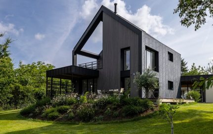
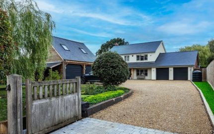
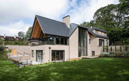
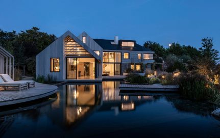
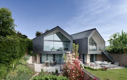
The Star House owes its name to its owner’s house guest, who after having the opportunity to experience the architecture, compared its shape to a star. The project made a great impression on him, so much so, he later asked the architects responsible for the Star House to design one especially for him.
The association made by the house guest is justified – the house consists of three volumes, placed radially to one another at different angles. It provides an interesting and rare opportunity to see the exterior facade of the house from the inside. Each volume represents different function: living, sleeping and utility.
The place where all three volumes intersect is the entrance zone. Because of its central placement, it provides easy access to all parts of the house. The huge glass panes, offering you a view of the garden and usage of the same roof lining material, that starts outside above terrace and continues inside the building, connect the design of the interior and the exterior.
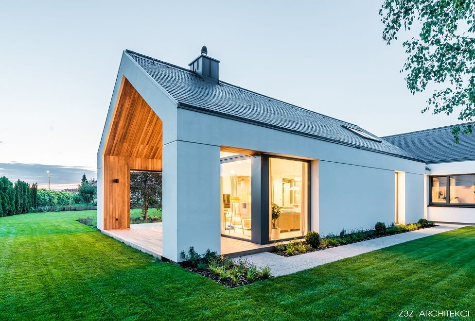
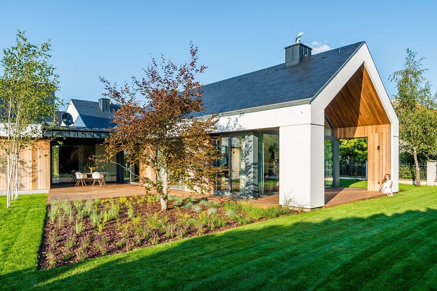
Thanks to its location between two main volumes of the building, is well hidden from the outside world. The overhang protects it from rain, snow and wind, providing shelter for its users. Its wooden finish corresponds with the floor materials used inside the building. It gives an illusion that the terrace is an internal part of the house – the interior and the exterior is perceived as one.
The terrace is accessible from the living area through a pair of big sliding glass doors. The living area consists of an open kitchen with a kitchen island, a dining room, a double height living room and a mezzanine that can be accessed from the hallway by a spiral staircase.
At the far end of the living room, there is a brick fireplace made from the same material as the facade of the house. It is another example of diluting the boundaries between inside and outside by the architects.
The fireplace is accompanied by floor-to-ceiling windows that are letting in abundant natural light and provide entrance to the second more intimate terrace of the house.
The general composition of the building, despite the multitude of elements, is rather simple. It is designed in a way where one part can provide multiple functions. This minimalistic approach perfectly fulfilled the requirements of the clients. One of the main goals was to design a house with plenty of natural light throughout the day, which was a starting point while making a first sketch of the Star House.
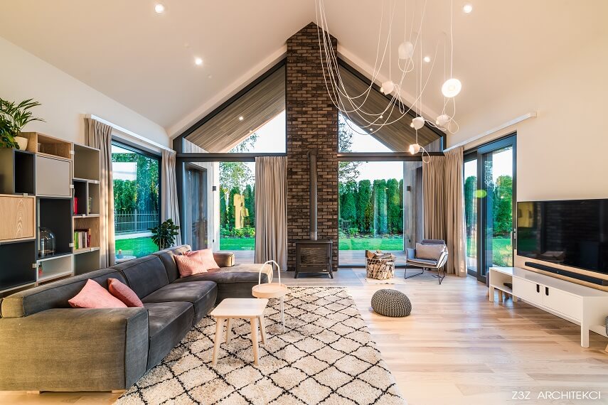
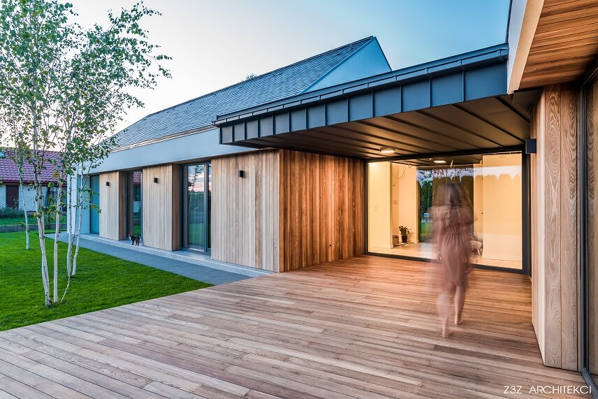
The designers at Z3Z Architekci followed the guidelines threw, so much so already the first proposal got the clients approval. The result, presented in the pictures, differs from it only in details, as it was refined long before starting the technical design.
Regarding the roof, the architect Mateusz Zajkowski commented:
We have chosen CUPA PIZARRAS because it has good quality and we like the surface of CUPA’s slate.
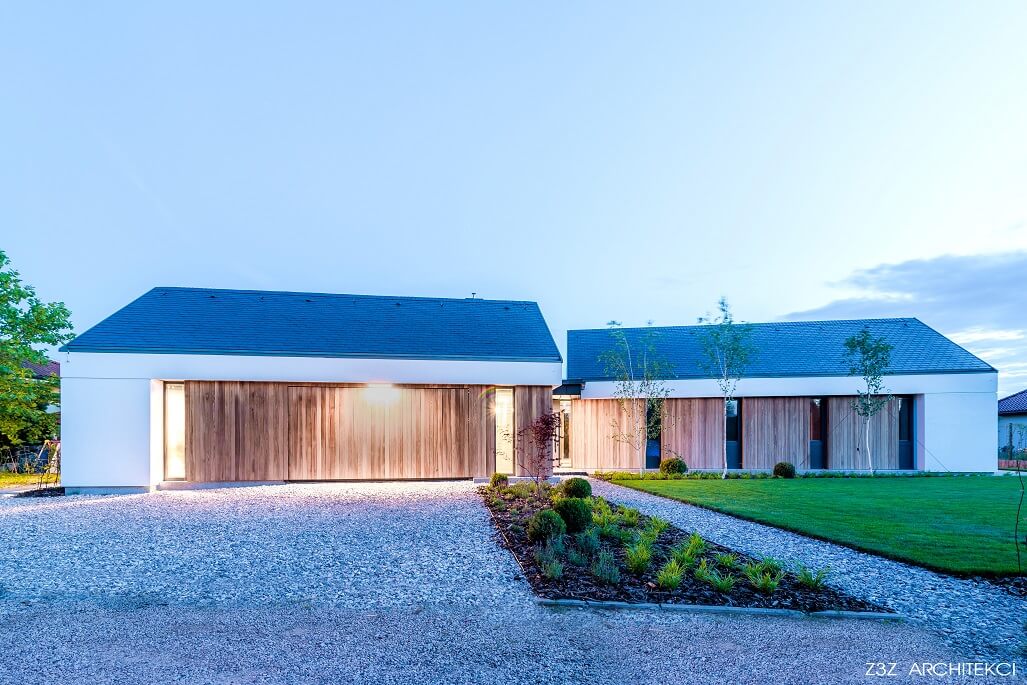
PRODUCT USED: CUPA 2
Dark grey natural slate with thin laminations and a smooth surface. Split to an average thickness of 5 mm and 6 mm.
Other case studies
More than 250 roofs are installed per day around the world with our slate.
Natural slate CUPA PIZARRAS has been highly valued by architects and has been selected for important projects within many cultural and historic buildings of interest, modern architecture or the construction or renovation of traditional housing.
If you have any questions, our experienced team on slate is at your disposal.

